Spektral has one window and very few screens. Learn the header and you know where everything is.
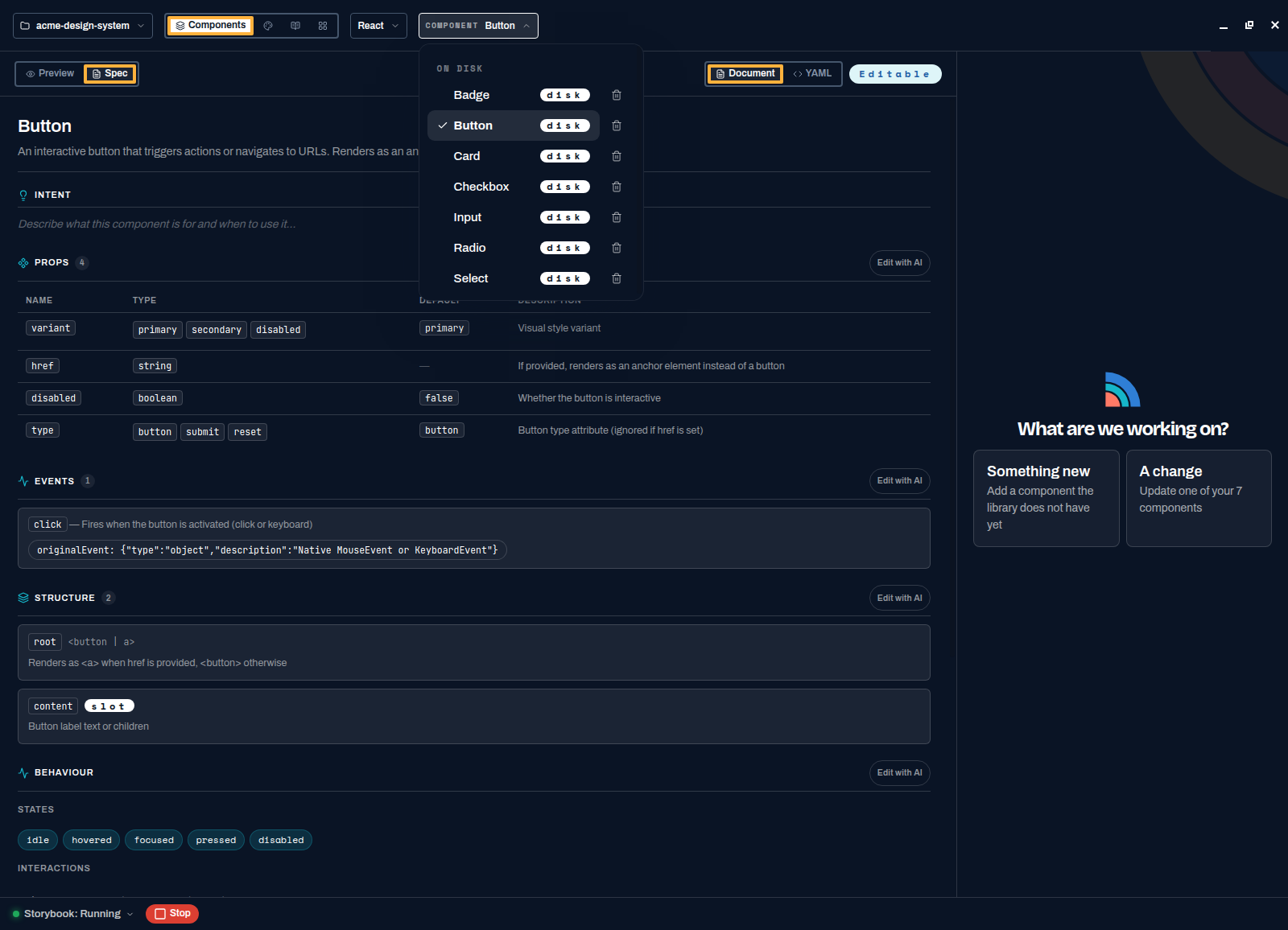
The header, left to right
- Project menu
The folder name in the far top-left. Open it to create a project, open another one, or reveal the current one in your file manager.
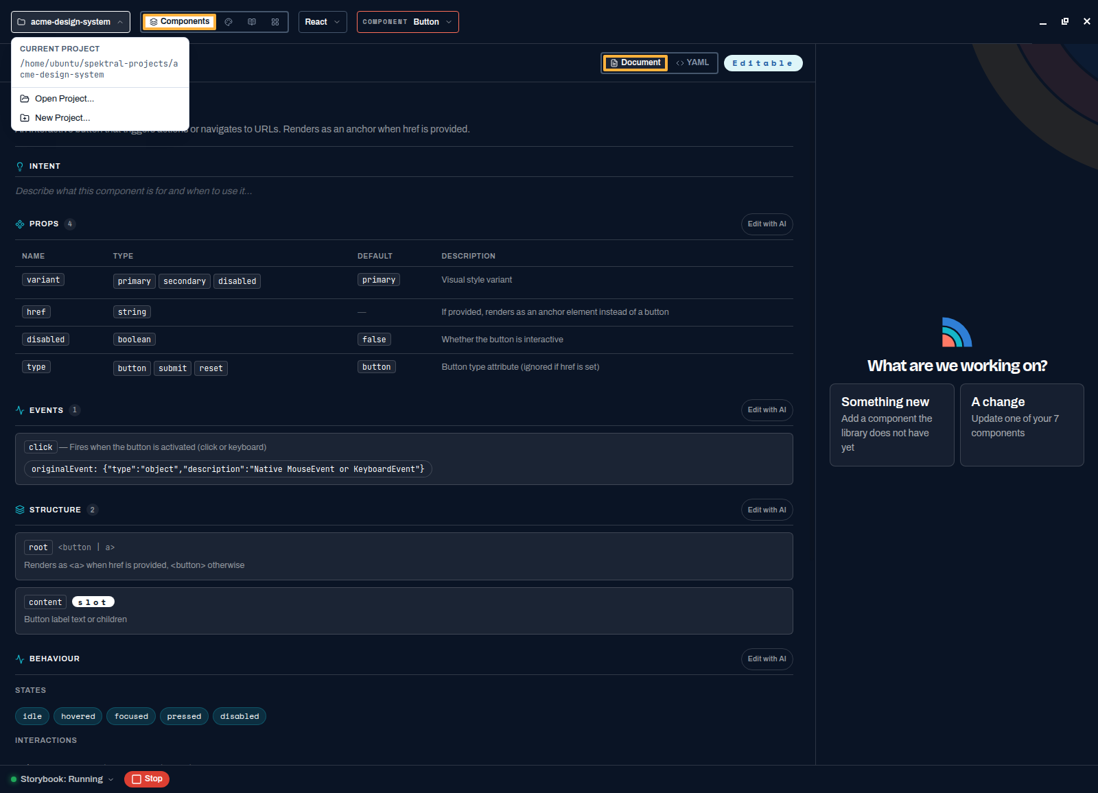
Everything project-level lives behind the folder name. - Page switcher
Four destinations: Components (build and inspect), Tokens (colour, spacing, type), Guidance (the rules the agent follows), and Matrix (what exists on which platform). Teams on a paid plan also get Releases and Work Orders.
- Platform selector
Which platform you are looking at — React, Vue, and so on. Switching it changes the code you see, not the spec or the tokens, because those are shared.
- Component selector
The component currently open. Use it to jump straight to another one, or press Browse Components to see the whole library as cards.
Preview and Spec
Every component has two views, toggled at the top-left of the content area.
- Preview
The component rendered live from your Storybook, with a controls table underneath. Change a prop and the preview updates; press Show code or Copy code to take the snippet into an app. This is the view to send to a designer or a product engineer.
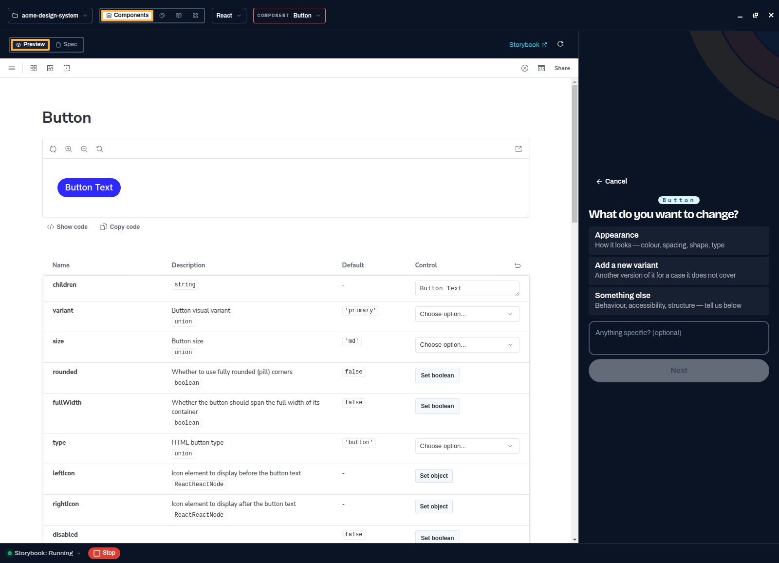
A live Storybook render plus interactive props — no separate tool to open. - Spec
The framework-agnostic contract: intent, props, events, structure, behaviour, states, and keyboard interactions. Read it as a document or flip to YAML for the file itself. Every section has an Edit with AI button, and the spec is what the agent reads whenever it regenerates or ports the component — so the reasoning travels with the code.
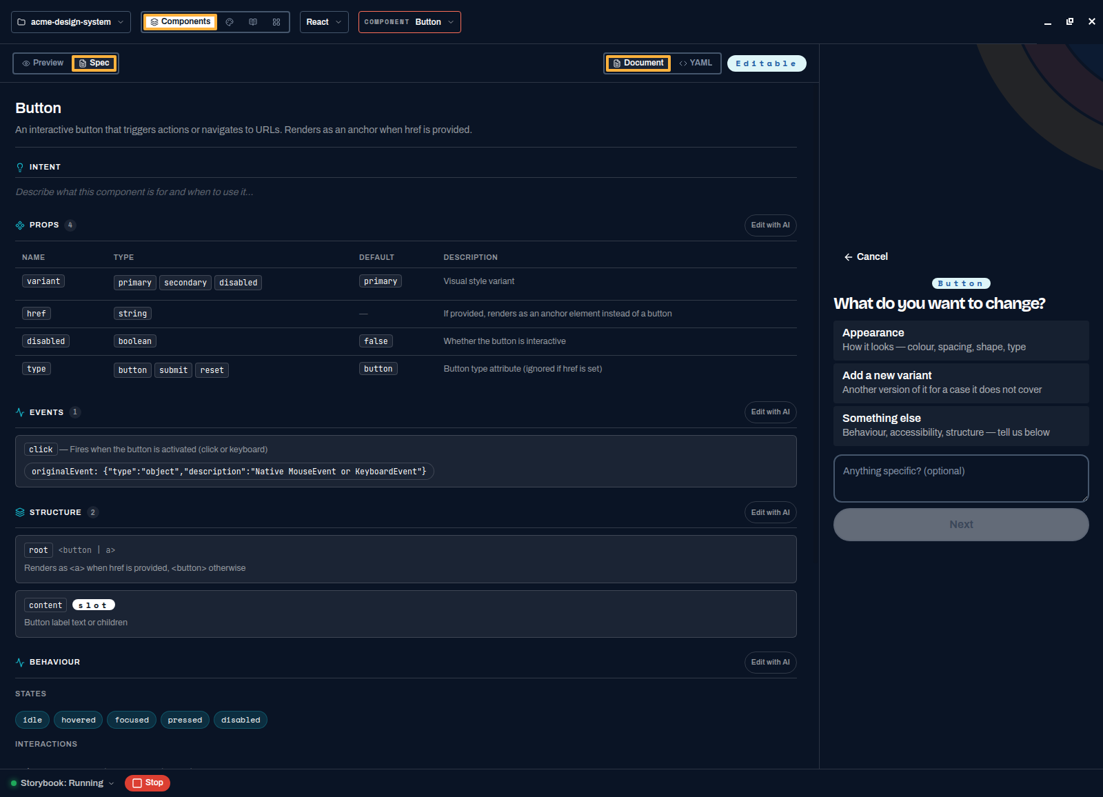
The spec is the source of truth. Code is a rendering of it, once per platform.
The chat panel
The right-hand panel is where work happens. Empty, it asks what you are working on — something new, or a change to what is open. While the agent runs it shows a plan, a live activity log of every tool call it makes, and a Stop button. See Build a component.
The Storybook bar
Bottom-left, there is a Storybook status light with Start and Stop. Spektral runs Storybook for you so previews render and accessibility checks can execute; the Storybook ↗ link in the Preview toolbar opens the full Storybook in your browser when you want the real thing.
You know the map. Next, build a component.