Most AI tools open on an empty box and wait for you to know the answer. Spektral asks instead — what are we working on, which component, and a few questions about that one specifically. You do not need to phrase a prompt, and you do not need to be a developer. This walkthrough builds an Alert from nothing; it took a few minutes end to end.
Build something new
- Say what you are working on
In the chat panel, choose Something new. Spektral reads what your library already has and suggests the gaps — a system with Button, Card, and Badge but no Alert or Modal is told so, with a line each on why the gap matters. The suggestions are a shortcut, not a menu: there is a field underneath for anything you want to name yourself.
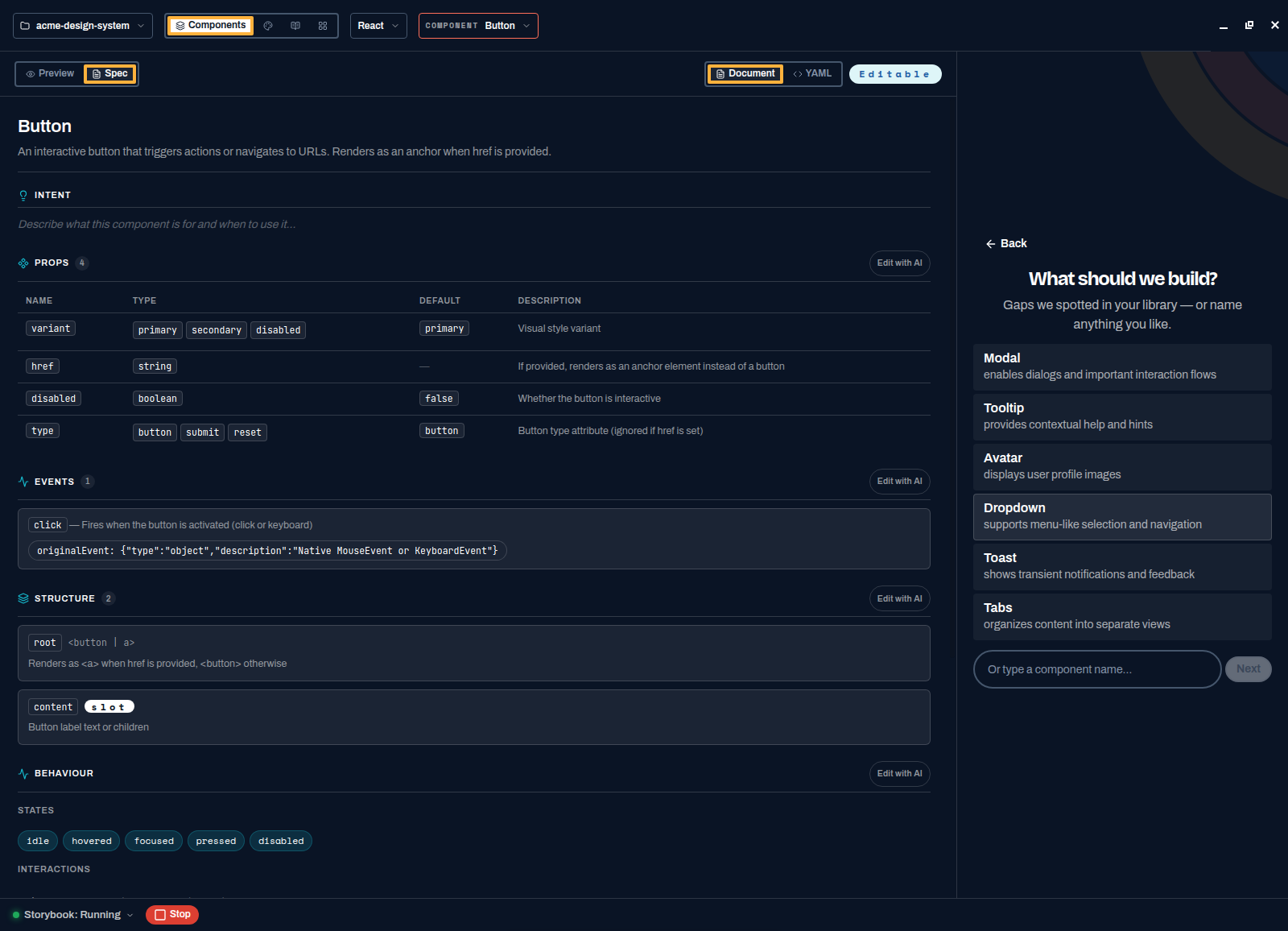
Suggestions come from your actual library, not a generic checklist. - Answer the intake
The questions come from the component you picked, so none of them are the generic ones you would answer for everything. An Alert is asked about severities and dismissal; a Table would be asked about sorting and density. Tick the answers and press Next.
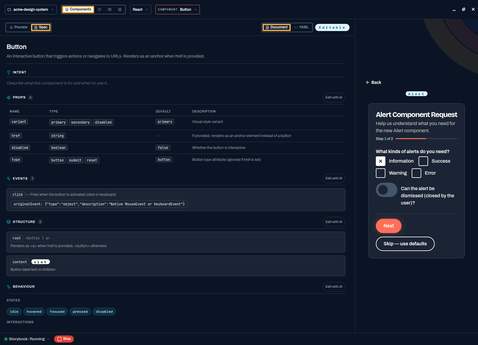
Component-specific questions, generated from what you asked for. 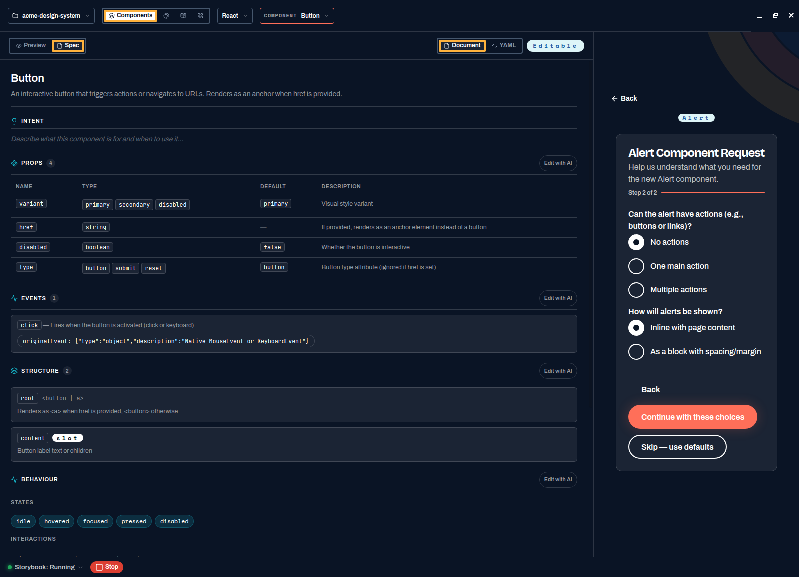
A couple of steps at most — this is an intake, not a form. - Say why you want it
Every route ends on the same question, and it is the one that matters six months later. Your answer is recorded in the spec as the rationale behind the decision, not acted on as an instruction. Code can tell the next person what a component does; only you can tell them why it exists in the shape it does. It is skippable — forcing a justification would only teach people to type "because".
- Approve the plan
Before touching a file, the agent proposes a plan: what it will write, in what order, to which paths, with a complexity and time estimate. Read it, then press Approve plan — or Comment to redirect it, or Cancel. Nothing is written until you approve.
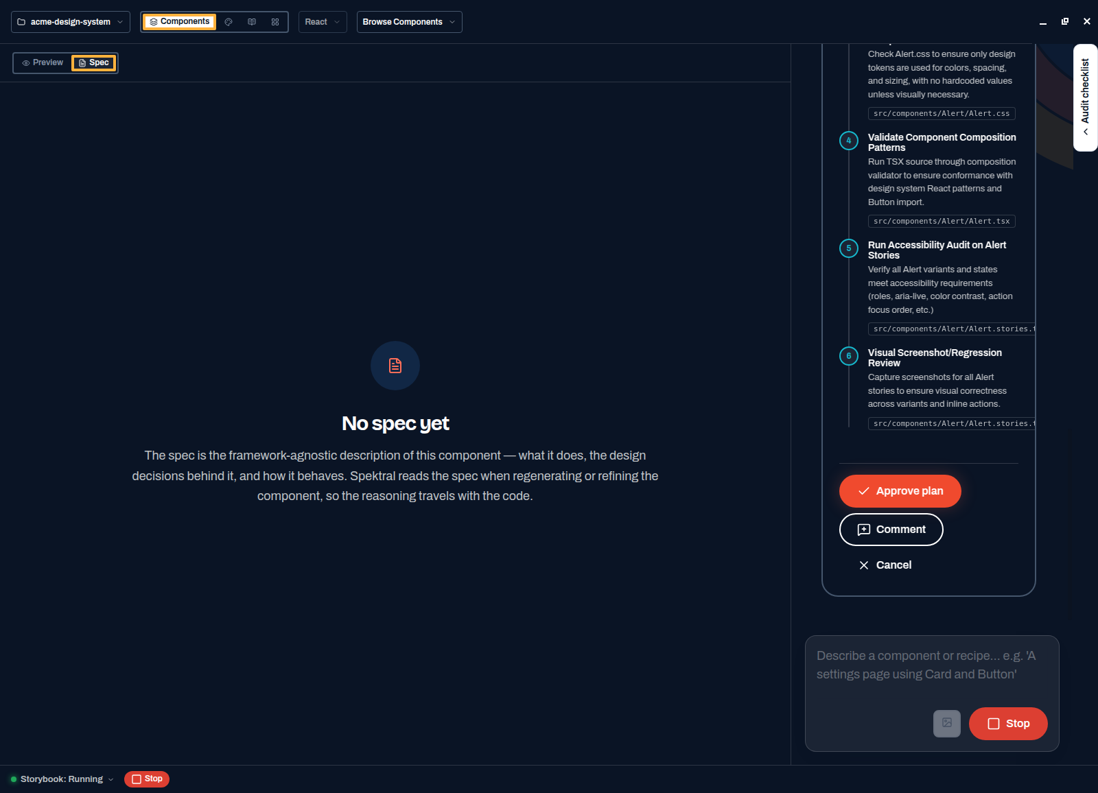
Six steps, each naming the file it touches — including validation and an accessibility audit. - Watch it work
The spec fills in live on the left — intent, usage do's and don'ts, and the decisions it made with the reasoning for each. The activity log on the right lists every tool call as it happens: reading the schema, your tokens, your guidance, writing files, validating CSS, screenshotting the result.
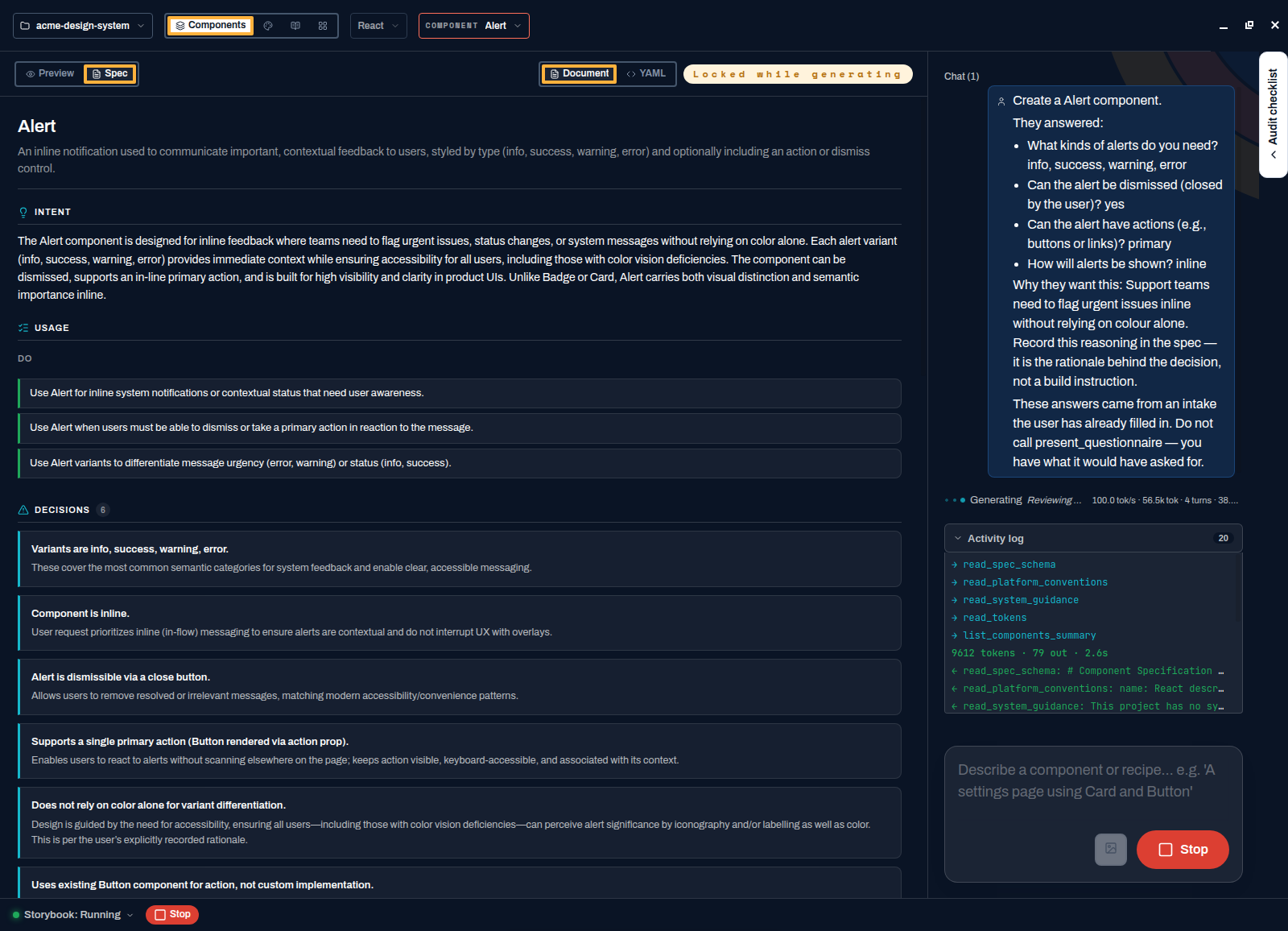
The spec is written first, so the reasoning exists before the code does. - Read the summary
When it finishes, the agent reports what it built, any judgement calls it made, and how to use the component — with a snippet you can paste into an app.
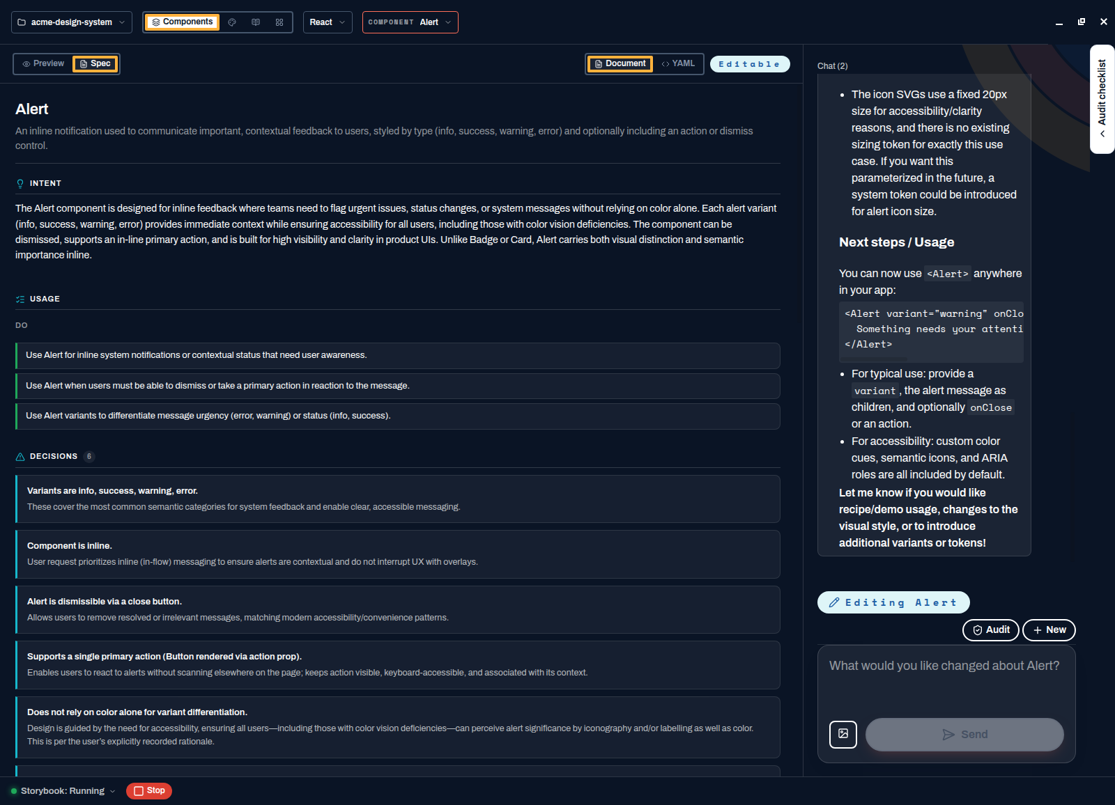
It flags its own compromises rather than burying them. - Try it in the preview
Switch to Preview. The component renders live from Storybook with every prop wired into a controls table, and its stories underneath. This one arrived with four severities, an optional action, a dismiss callback, and icons so severity is never signalled by colour alone.
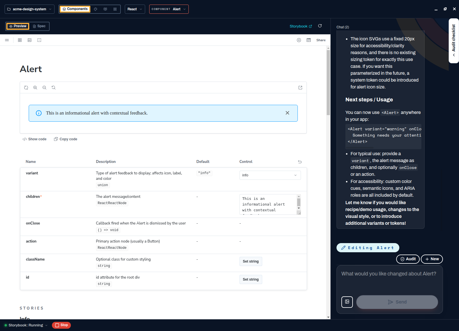
Generated from a two-minute intake: tokens throughout, no hardcoded colours.
Change something that exists
- Open the component
Pick it from the header, or choose A change in the chat panel. Both land in the same place, and the component loads into the preview while you decide — so you can see what you are about to change.
- Say what kind of change it is
Almost every change is one of three things: Appearance (colour, spacing, shape, type), Add a new variant, or Something else — behaviour, accessibility, structure. There is a box for anything specific you want to add.
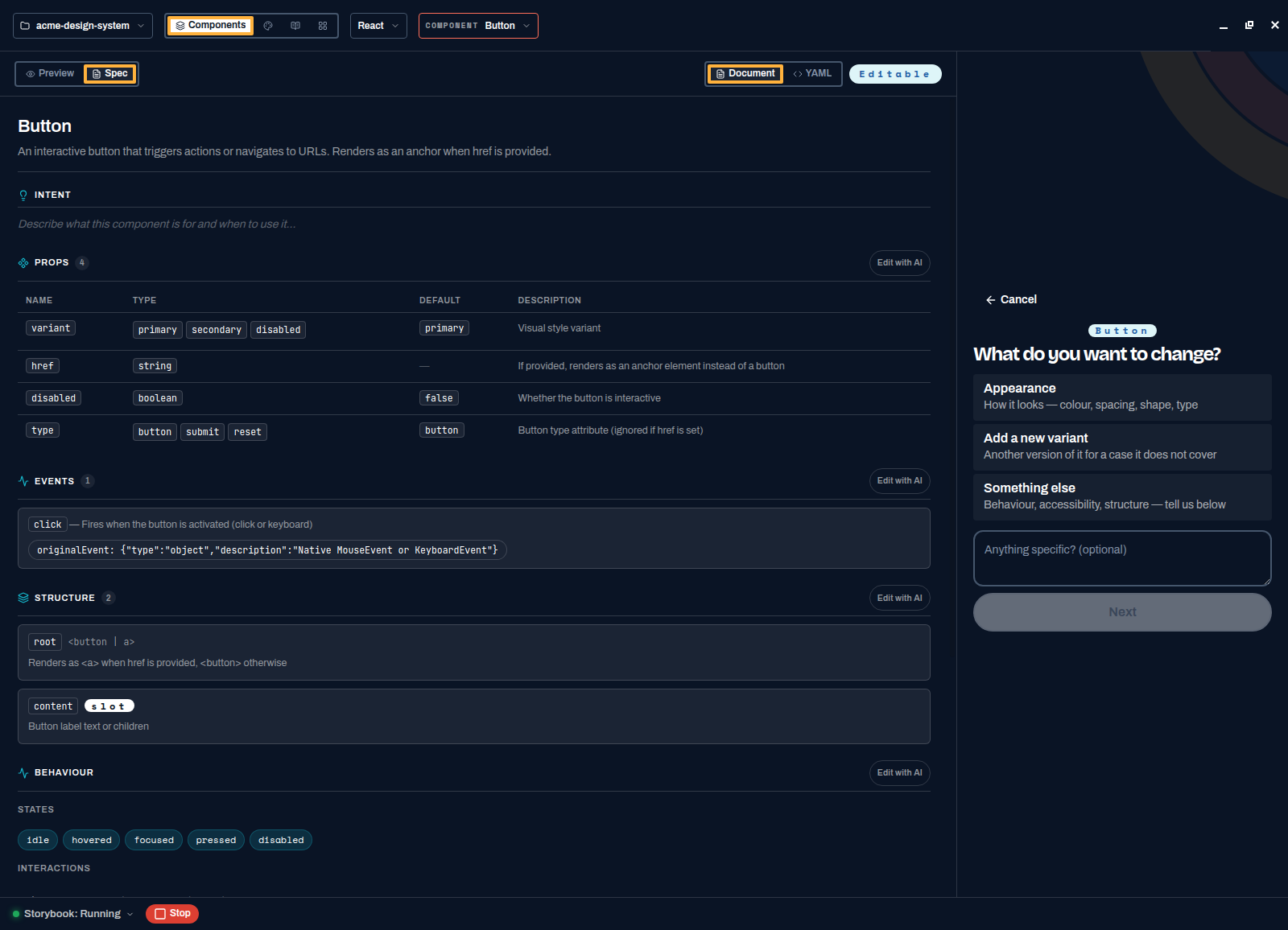
The component stays on screen while you describe the change. - Answer at most one follow-up
Spektral reads the component's current spec to decide whether another question is worth asking. Often it is not. When something is genuinely ambiguous you get one question, not a form.
- Approve and review
Same loop as before: plan, generation, validation, summary. The spec is updated alongside the code, so the record of why the component looks the way it does stays current.
After the first exchange
From there the chat is an ordinary conversation: describe a change, attach a screenshot, paste a Figma URL. The guided questions are for starting work, not for every exchange afterwards.
If the model is slow or unavailable
Suggestions and generated questions are conveniences, and the flow is built so neither can block you. If suggestions do not arrive, type a component name. If the questions do not arrive, go straight to work. If you skipped model setup entirely, everything else in the app still works — browsing, tokens, specs, Storybook — and you can add a provider whenever you are ready.