Tokens are the values your components are built from. Spektral generates components that reference tokens and never hardcode a colour or a size, so retheming the whole library is a handful of edits and a rebuild.
The three tabs
Open Tokens in the header. The tabs are three layers that build on each other, and knowing which one to edit is most of the skill.
- Primitive — the raw palette
Literal values with no meaning attached:
color.blue.500,spacing.4,fontSize.lg. Grouped by category down the left. Edit these to change what colours and sizes exist at all.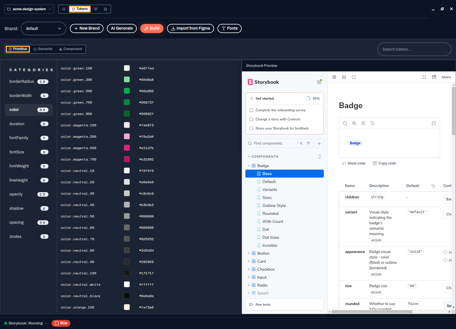
Primitives: hex values and numbers, with a live Storybook preview beside them. - Semantic — the decisions
Roles that point at primitives:
color.primary,color.error,color.on-surface,color.focus-ring. This is the layer you should edit most, because a change here has a meaning — "our error colour is now this" — rather than just changing a swatch.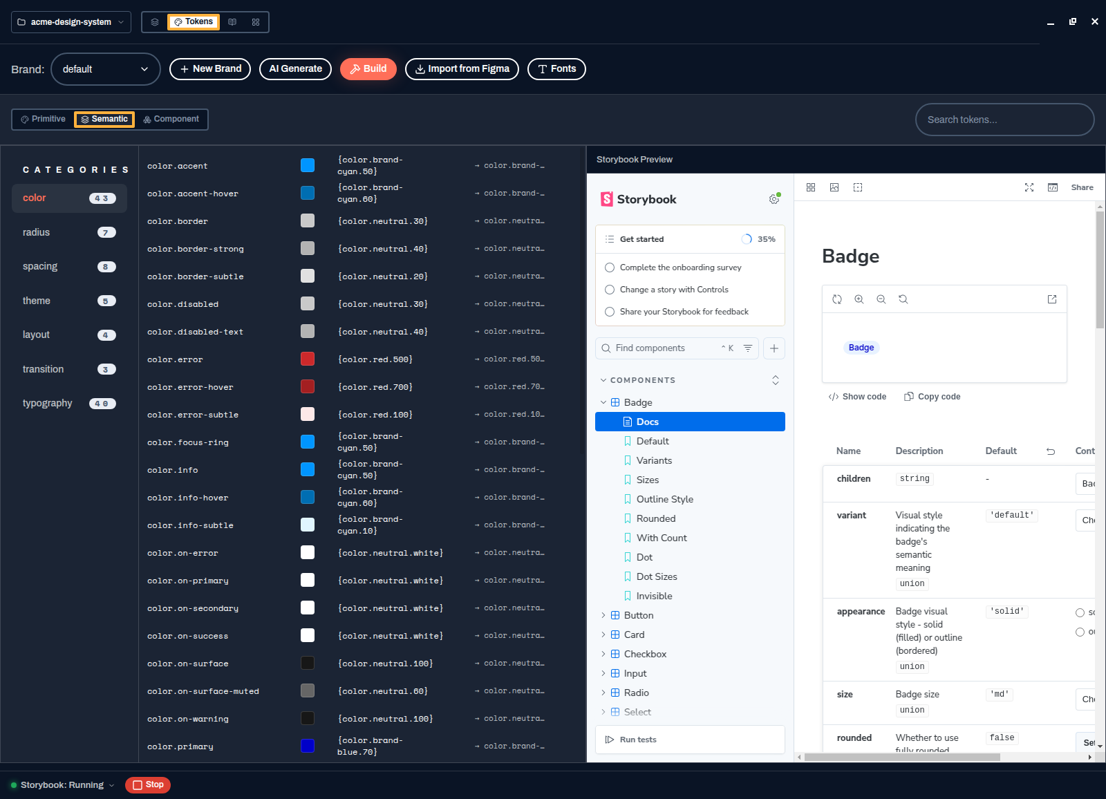
Each semantic token shows its reference and the primitive it resolves to. - Component — the exceptions
Per-component overrides such as button background or card padding, pointing at semantic tokens. Reach for these only when one component genuinely needs to differ.
Change a value
- Find the token
Use the search box, or pick a category on the left.
- Click the value and edit it
Primitives take a literal value. Semantic and component tokens take a reference in curly braces, and Spektral autocompletes it as you type — so
{color.brand-cyan.50}is offered with its swatch and resolved hex while you are still typing. That is what stops broken references.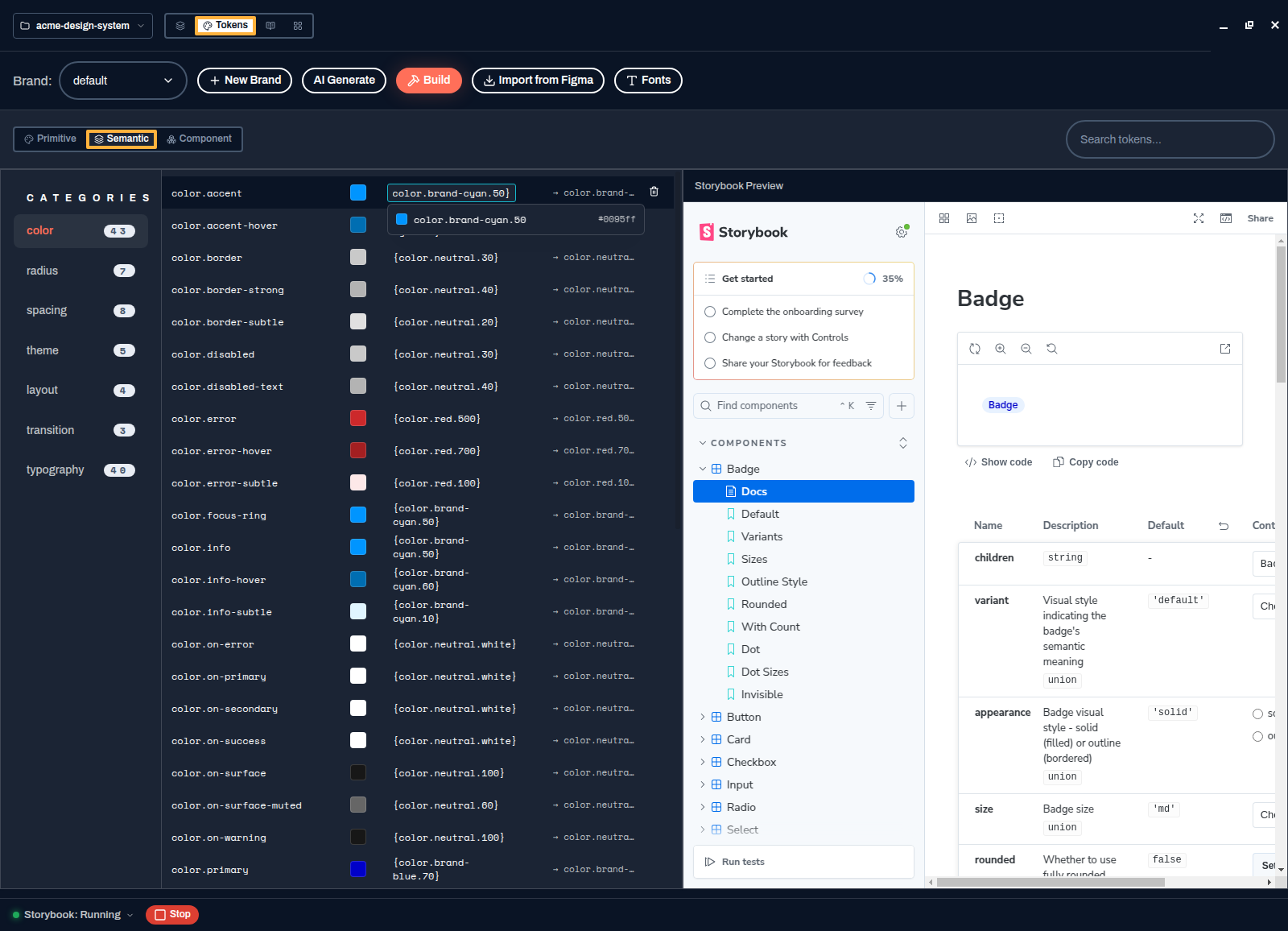
References autocomplete against the primitives that actually exist. - Press Build
Nothing reaches your components until you rebuild. Build runs Style Dictionary over the JSON and regenerates the CSS custom properties the library consumes. Storybook hot-reloads and the preview beside the token list updates.
color.primary at a different primitive changes every component that means "primary" — buttons, focus rings, links — in one edit, and leaves your palette intact.The rest of the toolbar
- Brand
The brand selector switches between token sets. New Brand adds another — a sub-brand or a client theme — that reuses your specs and components with different values.
- Mode
Appears when the project declares modes such as light and dark. Pick a non-default mode to edit only the tokens that change in it. For dark mode, use a mode rather than a brand: see Add dark mode.
- AI Generate
Describe a palette or a feel and let the agent propose a coherent set of tokens across the layers, rather than filling in fifty values by hand.
- Import from Figma
Pull variables and styles out of the file you have open in Figma. See Import from Figma.
- Fonts
Pick the typefaces the typography tokens resolve to.
Want the detail of how the three layers relate and what the JSON looks like on disk? That is in the token architecture reference.